RICHARD WRIGHTMAN
Role: Designer (Visual Identity, Collateral, Digital Applications)
Client: Richard Wrightman
Scope: Parent brand lockup + wordmark, collection-specific marks, collateral system, catalogs, trade show templates, website application, engraved branding iron
Richard Wrightman’s studio is known for reinterpreting campaign furniture with a modern sensibility, alongside bespoke commissions and other collections. I helped create a multi-faceted identity system that could unify the parent brand while giving distinction to individual lines — most notably the Modern Campaign Collection. The result was a toolkit that supported everything from product stamps to catalogs, trade shows, and digital presence.
THE CHALLENGE
The identity needed to balance two things: the timeless craftsmanship at the heart of Richard’s work, and the flexibility to represent multiple product lines under one umbrella. Each collection had its own story and emphasis — Modern Campaign blending heritage with modern design, Bespoke showcasing unique commissions — but the brand still needed to speak with one clear voice. The system also had to flex across diverse mediums: print, web, large-format trade show graphics, and physical applications like engraving into wood.
THE WORK
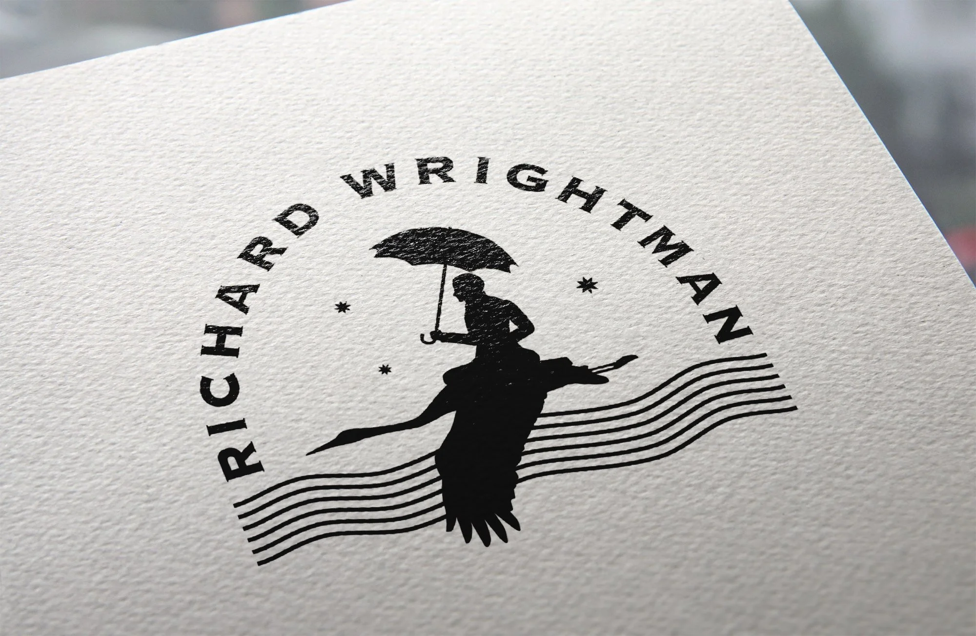
I designed a tiered identity system anchored by a primary lockup and wordmark, then expanded it with collection-specific marks that gave distinction where needed. For the Modern Campaign Collection, I created a logo variation that subtly referenced the heritage of travel furniture while feeling contemporary. This approach allowed the studio to highlight individual collections without diluting the master brand.
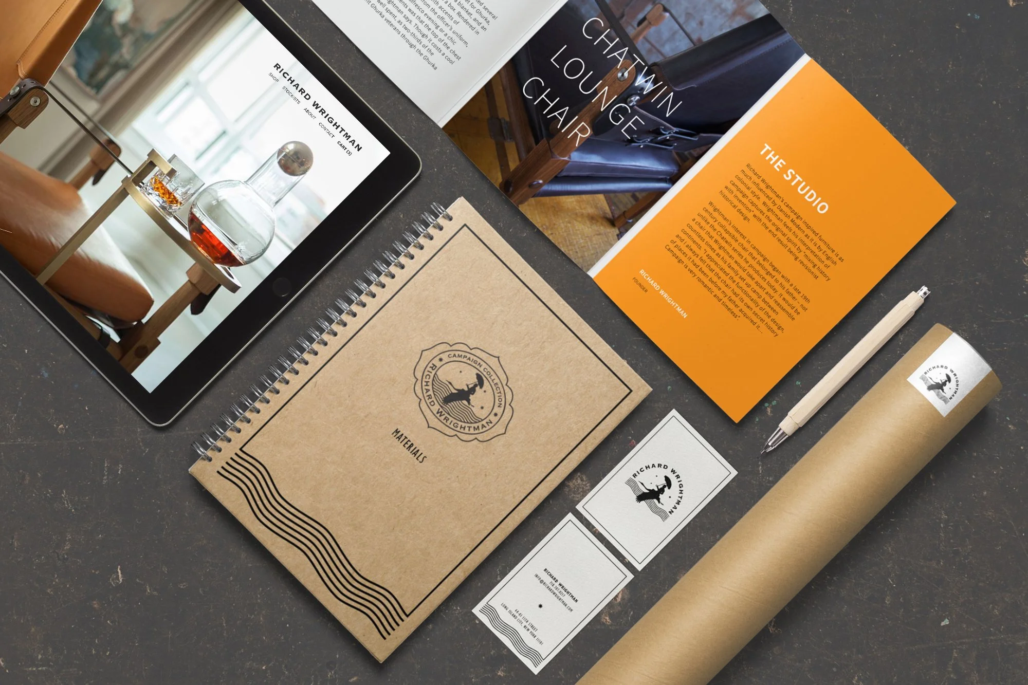
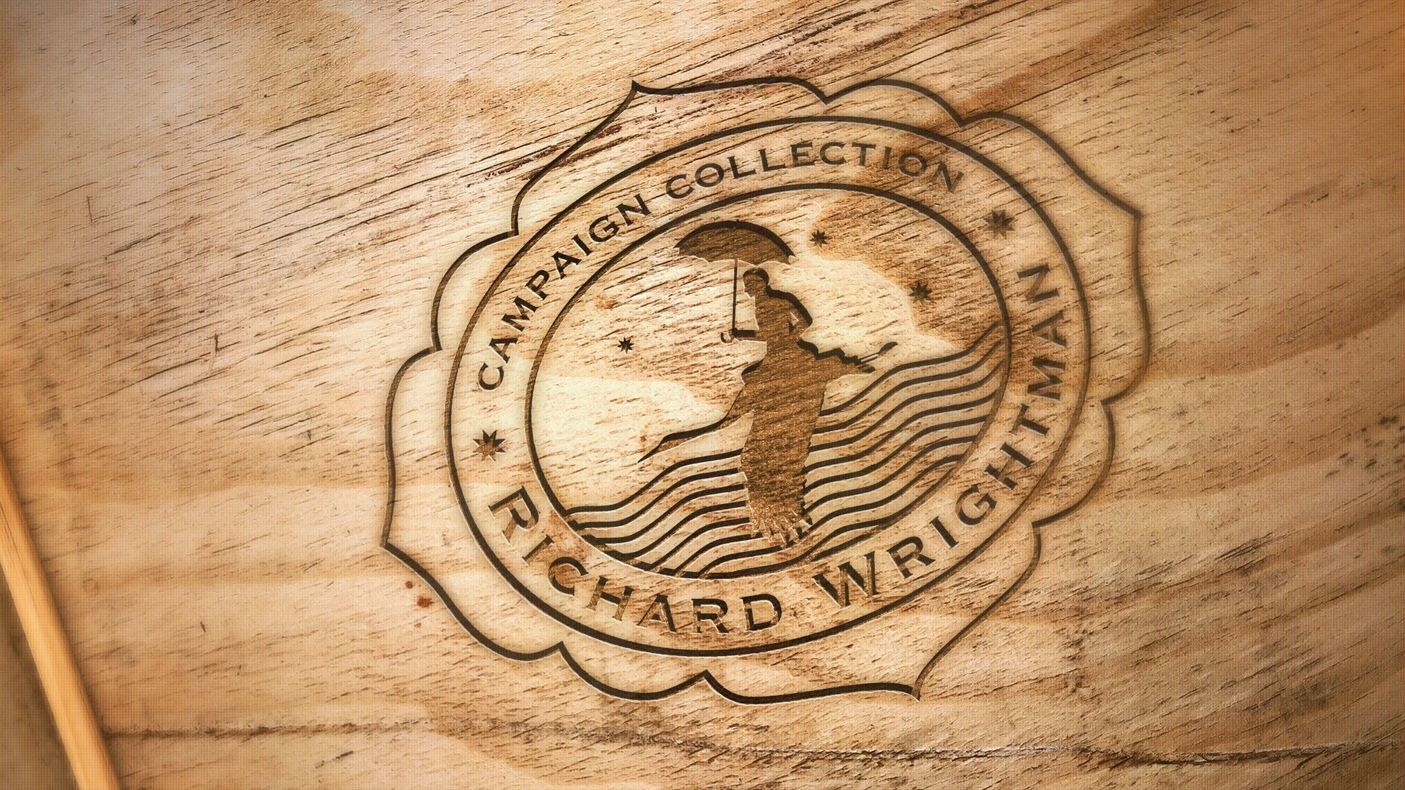
Collateral extended the system across business cards, catalogs, material lists, and marketing templates. I also designed large-format posters and trade show graphics that introduced the collections to design audiences. The branding was applied in tactile ways too: engraved branding irons and product stamps brought the identity directly onto the furniture, connecting design to craft. The website echoed the same balance — refined and modern while rooted in history.


MY ROLE
I led the creation of the identity system and collateral, partnering closely with Richard to ensure each element reflected his design philosophy. I developed the lockups, collection marks, and supporting materials, and extended the system across print, digital, and physical applications. My role was both creative and practical: building a design language that could carry across collections, scale internationally, and endure over time.
OUTCOME
The identity gave Richard Wrightman Design a flexible yet unified voice. By building a system that worked at the parent level and extended into individual collections, the brand could showcase its breadth while maintaining cohesion. From engraved product marks to trade show posters, the new identity elevated storytelling and helped position Richard Wrightman Design as a heritage-rooted yet forward-looking furniture maker.